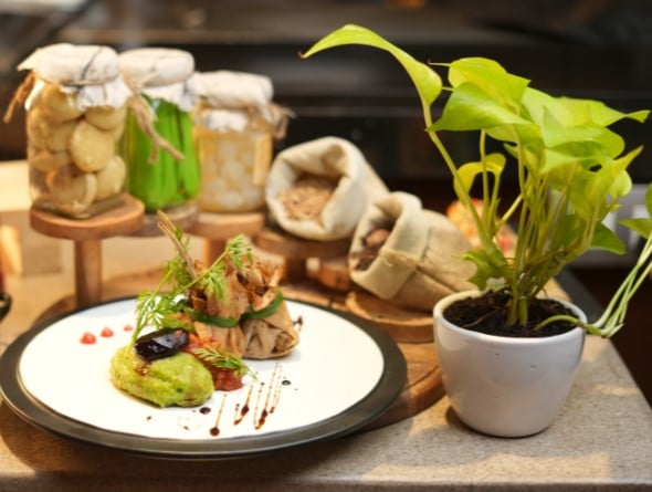
Mensho Tokyo is the first ever Japanese Restaurant at Delhi’s Greater Kailash 2, M Block Market which is under the Ramen Lounge Pvt. Ltd. Hospitality Group, offering authentic Ramen.

Designed and executed by Architect and Interior Designer Paushika Gupta, founder of Paushika Gupta Architecture+Design, Mensho Tokyo has 8 outposts in Japan itself, 2 in San Francisco & San Rafael and one in Bangkok, and have already been winning the trust of many around the globe. This particular outlet which is in India is headed by Chief Chef Tomoharo ‘Menya’ Shono, who flew directly from Japan to India along with his Kitchen army. The chef has been the sole creator of Ramen since the inception of Mensho Tokyo in 2005 and is also Michelin rated.


The sense of interiors of this 4 walled restaurant is all about experiencing a modern take on a traditional Japanese style ramen shop. The interior design of the space aligns with the restaurant’s ever-evolving yet simple and traditional Japanese cuisine. The focus remains on the food, and the harmonious combination of traditional Japanese design elements with contemporary twists providing guests with a refreshing dining atmosphere. The sense behind the entire escape was to bring around casual Japanese interiors. The brief given to Paushika Gupta was to have a breath of fresh air from the latest rush of fancy clubs and restaurants around Delhi and NCR. A fresh yet chic minimal interior concept to go with the comfort and calmness that is brought by each Ramen bowl.


The space underwent a thorough renovation, but Ms. Gupta sought to preserve certain elements that already characterised the space. For example, the minimal grey flooring, the wood and cane furniture scheme by Mr. Manzur and the entry wall of wooden fluting to maintain the warmth and cosiness that it adds to the space. Mensho Tokyo interiors are decisively restrained, an antidote to Delhi’s high octane interior scene. There are no statement chandeliers here. Just a simple dining space with wooden fluted panels and a bit of play on the white walls displaying the priority of Japanese life – simplicity.
A masonry wall that was previously hidden under wooden fluting is now exposed and runs along the length of the restaurant – in order to add a splash of white and freshness to the space. A groove pattern in POP adds some seamless play on the wall. It is decorated with blurbs describing the various components of ramen and a fun crossword puzzle custom made for the restaurant by Abraxas Lifestyle. Abraxas lifestyle has rendered branding services for the restaurant. Edgy, comfortable, personalised, Mensho Tokyo is a cosy shop that features pared-back styling, precise craft and usage of natural materials – qualities that have long been central to the design traditions of Japan and India.

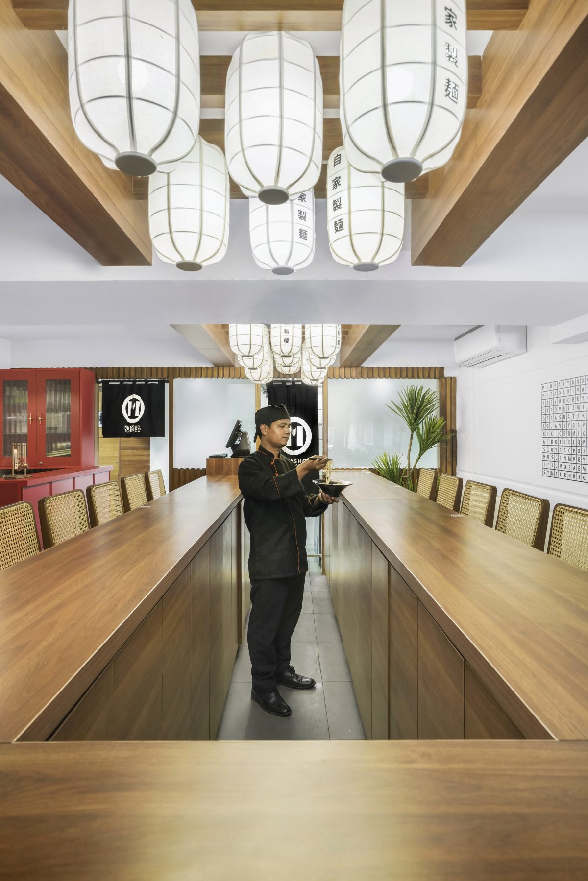
In the open-plan dining and kitchen, the kitchen shares the spotlight with the interiors wherein one can view the skills of the chef preparing food. The entry wall sets the tone for the overall design experience with linear slats running up the wall. Guests can see all areas of the restaurant, the seating for 4s and 2s, along with the communal table, the kitchen functioning and the bar counter.
Furnishings and pendant lighting fixtures are used to set the boundaries of each dining area. Circular pendant lights are set above the dining area with medium-back cane and wood chairs. For larger groups, they have a communal table which seats at least 18 people. An art cum light installation is added on top of the communal table to highlight the space of paper lanterns with Japanese scribblings. This works well in terms of changing the atmosphere and going in for a smooth transition of light dimming from ramen-shop-café in the day to ramen-shop-club at night.

The medium wood tones are contrasted against the white backdrop, and an all-red-bar brings an eclectic accent to the design. While wooden elements are often expected in Japanese restaurants, the addition of red colour adds a modern twist to the dining experience while still tying back to traditional Japanese design.
The bathroom is a complete contrast to the restaurant and has been done in a mono-toned grey tile with visible grout grooves. The tiles flow from the floor to the walls in one singular manner. The ceiling has a washed concrete finish with dimmed down lighting. Continuing with the red colour palette, there is a neon sign reading, “Send me noods” in front of the wc which is legible once the user looks at the mirror. The bathroom is where the red light shines. It is a combination between textured materials and a simple yet bold pop of colour, distinctive for traditional Japanese interiors.


While the interiors are pared-down, plenty of wood detailing gives the space an inviting feeling, and lantern-like lights and green plants have been added to soften the minimalist aesthetic. The mix of warm timbers along with the black and red colour palette makes the restaurant interior exude a certain sophistication that resonates with its Asian style.